Introduction
The healthcare industry is a treasure trove of data, offering insights into patient behavior, treatment outcomes, and financial aspects such as insurance claims. Leveraging this data can unearth patterns that are not just academically intriguing but also hold immense potential for policy-making and strategic planning. Recent analyses employing various visualization techniques in Power BI have revealed compelling findings in the domain of health insurance claims.
Correlation Between BMI and Claim Amounts: A Scatter Plot Analysis
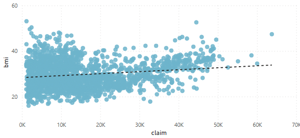
A scatter plot of BMI against claim amounts suggests a relationship that warrants attention. With BMIs ranging widely, the claim amounts show a wide dispersion, yet higher BMIs appear to have an upward trend in claim amounts. This raises the question of how weight management could be integral not only to health outcomes but also to financial aspects of healthcare.
Hereditary Diseases and Claims: Bar Charts that Tell the Tale
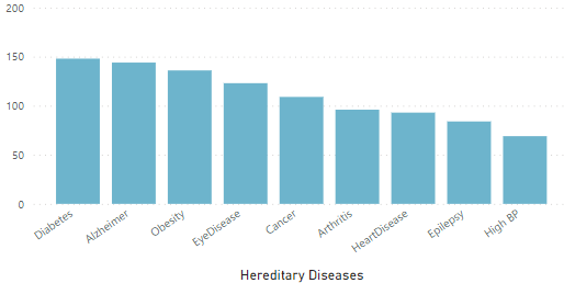
Bar charts comparing the count of claims associated with hereditary diseases reveal that Diabetes, Alzheimer’s, and Obesity lead to a higher number of claims. These visuals put a spotlight on the chronic conditions that are contributing significantly to healthcare costs, emphasizing the need for focused preventative care programs.
The Smoking Gun: Funneling into Average Claim Amounts
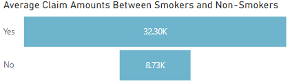
A striking disparity emerges when examining the average claim amounts between smokers and non-smokers through funnel charts. Smokers’ average claims are significantly higher, a fact that underlines the long-term financial strain smoking puts on healthcare systems, in addition to the well-known health risks.
Gender Disparities in Claims: A Bar Chart Comparison
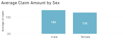
When assessing average claim amounts by sex, bar charts show that males tend to have higher claim amounts than females. This gender-based difference in healthcare costs may reflect varying health service usage patterns and possibly differences in health condition prevalence or severity.
Geographic Disparities: Average Claim Amount by City
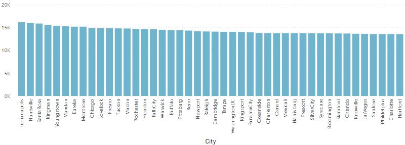
A deeper dive into the geographic data shows that average claim amounts vary considerably by city. Places like Indianapolis, Huntsville, and Santa Rosa have higher average claims, hinting at regional differences in healthcare costs, possibly driven by local pricing of services, variations in health conditions, or access to care.
Age, Sex, and Claims: Drawing Lines of Difference
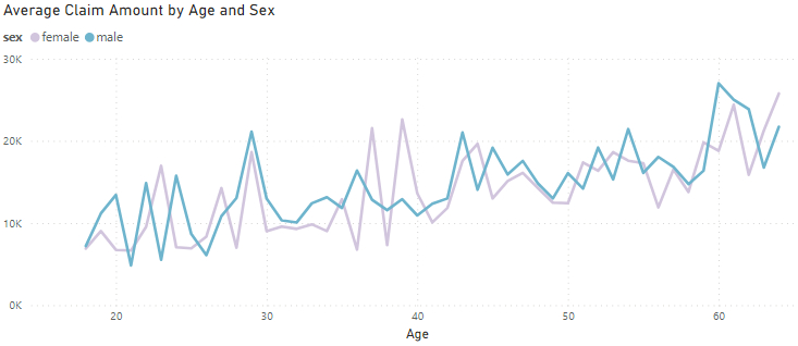
Line charts correlating age and sex with average claim amounts paint a complex picture. Older age groups, particularly males, tend to have higher claims. However, peaks and troughs across age groups suggest that age-related health issues contribute unevenly to insurance claims over a lifetime.
Insights and Implications
The patterns revealed through these visualizations point to broader implications for healthcare stakeholders. For insurers and healthcare providers, understanding the factors driving claim amounts can inform risk assessment and patient education efforts. For policymakers, these insights highlight the chronic conditions and lifestyle choices that significantly impact healthcare spending, suggesting areas where intervention can reduce long-term costs.
For the public, these data visualizations serve as a reminder of the financial consequences of lifestyle choices and the importance of preventative care. As we continue to navigate through a data-rich healthcare environment, such visual analytics will become increasingly critical in shaping a cost-effective, efficient, and equitable healthcare system.
The detailed data and visuals highlight the significant opportunities for targeted interventions and policy development to mitigate the financial impacts of health issues on individuals and the healthcare system at large.